안녕하세요 쥬_developer입니다!
내일은 날씨가 좋아서 미리 공부 후 봄 나들이를 갈 예정입니다 호호 😊😊😊
지난 시간의 넘파이 판다스에 이어서
이번시간에는 matplotlib로 그래프 그리기에 대해 알아보도록 하겠습니다~!!
matplotlib는 파이썬에서 데이터를 효과적으로 시각화하기 위해 만든 라이브러리를 뜻합니다.
• matplotlib 홈페이지: https://matplotlib.org/
맷플롯립(Matplotlib)은 데이터를 차트(chart)나 플롯(plot)으로 시각화하는 패키지입니다.
데이터 분석에서 Matplotlib은 데이터 분석 이전에 데이터 이해를 위한 시각화나, 데이터 분석 후에 결과를 시각화하기 위해서 사용됩니다.
저의 팀의 궁극적인 목적인 신용평가 후 결과를 시각화하는 팀프로젝트인데 이때 필수로 사용되겠죠?
아나콘다를 설치하지 않았다면 아래의 커맨드로 Matplotlib를 별도 설치할 수 있습니다.
pip install matplotlib
> ipython
...
In [1]: import matplotlib as mpl
In [2]: mpl.__version__
Out[2]: '2.2.3'
이번에도 import를 할 때에 관례상 plt이라는 명칭을 사용하도록 하겠습니다~!
import matplotlib.pyplot as plt
matplotlib : 선 그래프
import matplotlib.pyplot as plt
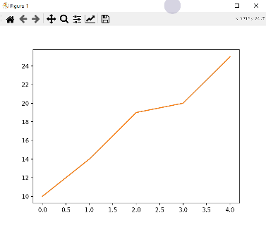
data1 = [10, 14, 19, 20, 25]
plt.plot(data1)
plt.show()matplotlib에서는 다음과 같은 형식으로 2차원 선 그래프를 그립니다.
• plt.plot([x,] y [,fmt]): x/y축의 좌표, ftmt(format string)으로 다양한 그래프 옵션
plot()은 라인 플롯을 그리는 기능을 수행합니다.
plot()에 x축과 y축의 값을 기재하고 그림을 표시하는 show()를 통해서 시각화해 봅시다.
그래프에는 title('제목')을 사용하여 제목을 지정할 수 있습니다.
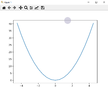
import numpy as np
x = np.arange(-4.5, 5, 0.5) # 배열 x 생성. 범위: [-4.5, 5), 0.5씩 증가
y = 2*x**2 # 수식을 이용해 배열 x에 대응하는 배열 y 생성
print([x,y])
'''
[array([-4.5, -4. , -3.5, -3. , -2.5, -2. , -1.5, -1. , -0.5, 0. , 0.5,
1. , 1.5, 2. , 2.5, 3. , 3.5, 4. , 4.5]), array([40.5, 32. , 24.5, 15. , 12.5, 8. , 4.5, 2. , 0.5, 0. , 0.5,
2. , 4.5, 8. , 12.5, 15. , 24.5, 32. , 40.5])]
'''
plt.plot(x,y)
plt.show()
x축과 y축 각각에 축이름을 삽입하고 싶다면 xlabel('넣고 싶은 축이름')과 ylabel('넣고 싶은 축이름')을 사용합니다. 위의 그래프에 hours와 score라는 축이름을 각각 추가해 봅시다.
plt.title('test')
plt.plot([1,2,3,4],[2,4,8,6])
plt.xlabel('hours')
plt.ylabel('score')
plt.show()
matplotlib : 여러 그래프 그리기
이번에는 하나의 그래프 창에 여러 개의 데이터를 효과적으로 시각화하겠습니다.
figure()를 실행하면 새로운 그래프 창이 생성되고 그곳에 그래프를 그린다. plt.figure(n)과 같은 방법으로 인자 n(정수)를 지정하면 지정된 번호로 그래프 창이 지정됩니다.
하나의 그래프 창을 하위 그래프 영역으로 나누기 위해서는 plt.subplot(m, n, p) 형식을 이용합니다.
예) subplot(2, 2, 1)이라면 2x2 행렬로 이뤄진 4개의 하위 그래프 위치에서 1번 위치에 그래프를 그린다는 의미입니다.
matplotlib : 그래프의 출력 범위 지정하기
출력되는 그래프의 x축과 y축의 좌표 범위를 지정해 전체 그래프 중 관심 영역만 그래프로 그릴 수 있습니다.
• plt.xlim(xmin, xmax) # x축의 좌표 범위 지정(xmin ~ xmax)
• plt.ylim(ymin, ymax) # y축의 좌표 범위 지정(ymin ~ ymax)
• [xmin, xmax] = plt.xlim() # x축의 좌표 범위 가져오기
• [ymin, ymax] = plt.ylim() # y축의 좌표 범위 가져오기
• 11~14: xlim()와 ylim()로 축의 범위를 지정해 그래프의 관심 영역을 확대합니다.
import matplotlib.pyplot as plt
import numpy as np
x = np.linspace(-4, 4, 100) # [-4, 4] 범위에서 100개의 값 생성
y1 = x**3
y2 = 10*x**2 - 2
plt.plot(x, y1, x, y2)
plt.show()
plt.plot(x, y1, x, y2)
plt.xlim(-1, 1)
plt.ylim(-3, 3)
plt.show()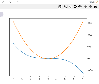

matplotlib : 그래프 꾸미기
그래프의 출력 형식을 지정할 때에
plot()에서 fmt 옵션을 이용하면 그래프의 컬러, 선의 스타일, 마커를 지정할 수 있습니다~!!
• 형식: fmt = '[color][line_style][marker]'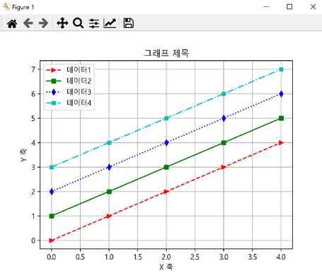
import matplotlib
import matplotlib.pyplot as plt
import numpy as np
x = np.arange(-4.5, 5, 0.5)
y = 2*x**3
plt.plot(x, y)
plt.xlabel('X-axis')
plt.ylabel('Y-axis')
plt.show()
plt.plot(x, y)
plt.xlabel('X-axis')
plt.ylabel('Y-axis')
plt.title('Graph title')
plt.show()
plt.plot(x, y)
plt.xlabel('X-axis')
plt.ylabel('Y-axis')
plt.title('Graph title')
plt.grid(True) # 'plt.grid()'도 가능
plt.show()
x = np.arange(0, 5, 1)
y1 = x
y2 = x + 1
y3 = x + 2
y4 = x + 3

plt.plot(x, y1, '>--r', x, y2, 's-g', x, y3, 'd:b', x, y4, '-.Xc')
plt.legend(['data1', 'data2', 'data3', 'data4'])
plt.show()
plt.plot(x, y1, '>--r', x, y2, 's-g', x, y3, 'd:b', x, y4, '-.Xc')
plt.legend(['data1', 'data2', 'data3', 'data4'], loc='lower right')
plt.show()
matplotlib.rcParams['font.family'] = 'Malgun Gothic' # '맑은 고딕'으로 설정
matplotlib.rcParams['axes.unicode_minus'] = False
plt.plot(x, y1, '>--r', x, y2, 's-g', x, y3, 'd:b', x, y4, '-.Xc')
plt.legend(['데이터1', '데이터2', '데이터3', '데이터4'], loc='best')
plt.xlabel('X 축')
plt.ylabel('Y 축')
plt.title('그래프 제목')
plt.grid(True)
plt.show()
matplotlib : scatter 그래프 꾸미기
산점도(scatter 그래프)는 두 개의 요소로 이뤄진 데이터 집합의 관계
(예를 들면, 키와 몸무게와의 관계, 기온과 아이스크림 판매량과의 관계, 공부 시간과 시험 점수와의 관계)를
시각화하는데 유용하게 사용됩니다.

import matplotlib.pyplot as plt
import numpy as np
height = [165, 177, 160, 180, 185, 155, 172] # 키 데이터
weight = [62, 67, 55, 74, 90, 43, 64] # 몸무게 데이터
plt.scatter(height, weight)
plt.xlabel('Height(m)')
plt.ylabel('Weight(Kg)')
plt.title('Height & Weight')
plt.grid(True)
plt.scatter(height, weight, s=500, c='r') # 마커 크기는 500, 컬러는 붉은색(red)
plt.show()

size = 100 * np.arange(1, 8) # 데이터별로 마커의 크기 지정
colors = ['r', 'g', 'b', 'c', 'm', 'k', 'y'] # 데이터별로 마커의 컬러 지정
plt.scatter(height, weight, s=size, c=colors)
plt.show()
import matplotlib
matplotlib.rcParams['font.family'] = 'Malgun Gothic' # '맑은 고딕'으로 설정
matplotlib.rcParams['axes.unicode_minus'] = False
city = ['서울', '인천', '대전', '대구', '울산', '부산', '광주']
# 위도(latitude)와 경도(longitude)
lat = [37.56, 37.45, 36.35, 35.87, 35.53, 35.18, 35.16]
lon = [126.97, 126.70, 127.38, 128.60, 129.31, 129.07, 126.85]
# 인구 밀도(명/km^2): 2017년 통계청 자료
pop_den = [16154, 2751, 2839, 2790, 1099, 4454, 2995]
size = np.array(pop_den) * 0.2 # 마커의 크기 지정
colors = ['r', 'g', 'b', 'c', 'm', 'k', 'y'] # 마커의 컬러 지정
plt.scatter(lon, lat, s=size, c=colors, alpha=0.5)
plt.xlabel('경도(longitude)')
plt.ylabel('위도(latitude)')
plt.title('지역별 인구 밀도(2017)')
for x, y, name in zip(lon, lat, city):
plt.text(x, y, name) # 위도 경도에 맞게 도시 이름 출력
plt.show()
matplotlib :막대그래프 꾸미기
막대(bar) 그래프는 값을 막대의 높이로 나타내므로 여러 항목의 수량이 많고 적음을 한눈에 알아볼 수 있습니다.

import matplotlib

import numpy as np
import matplotlib.pyplot as plt
member_IDs = ['m_01', 'm_02', 'm_03', 'm_04'] # 회원 ID
before_ex = [27, 35, 40, 33] # 운동 시작 전
after_ex = [30, 38, 42, 37] # 운동 한 달 후
n_data = len(member_IDs) # 회원이 네 명이므로 전체 데이터 수는 4
index = np.arange(n_data) # NumPy를 이용해 배열 생성 (0, 1, 2, 3)
plt.bar(index, before_ex) # bar(x,y)에서 x=index, height=before_ex 로 지정
plt.show()
plt.bar(index, before_ex, tick_label=member_IDs)
plt.show()
colors = ['r', 'g', 'b', 'm']
plt.bar(index, before_ex, color=colors, tick_label=member_IDs)
plt.show()
plt.bar(index, before_ex, tick_label=member_IDs, width=0.6)
plt.show()
colors = ['r', 'g', 'b', 'm']
plt.barh(index, before_ex, color=colors, tick_label=member_IDs)
plt.show()
matplotlib.rcParams['font.family'] = 'Malgun Gothic' # '맑은 고딕'으로 설정
matplotlib.rcParams['axes.unicode_minus'] = False
barWidth = 0.4
plt.bar(index, before_ex, color='c', align='edge',
width=barWidth, label='before')
plt.bar(index + barWidth, after_ex, color='m',
align='edge', width=barWidth, label='after')
plt.xticks(index + barWidth, member_IDs)
plt.legend()
plt.xlabel('회원 ID')
plt.ylabel('윗몸일으키기 횟수')
plt.title('운동 시작 전과 후의 근지구력(복근) 변화 비교')
plt.show()
matplotlib : 파이 그래프 꾸미기
파이(pie) 그래프는 원 안에 데이터의 각 항목이 차지하는 비율만큼 부채꼴의 크기를 갖는 영역으로 이뤄진 그래프입니다.
import matplotlib
import matplotlib.pyplot as plt
matplotlib.rcParams['font.family'] = 'Malgun Gothic' # '맑은 고딕'으로 설정
matplotlib.rcParams['axes.unicode_minus'] = False
fruit = ['사과', '바나나', '딸기', '오렌지', '포도']
result = [7, 6, 3, 2, 2]
plt.pie(result)
plt.show()
plt.figure(figsize=(5,5))
plt.pie(result)
plt.show()
plt.figure(figsize=(5,5))
plt.pie(result, labels= fruit, autopct='%.1f%%')
plt.show()
plt.figure(figsize=(5,5))
plt.pie(result, labels= fruit, autopct='%.1f%%', startangle=90, counterclock = False)
plt.show()
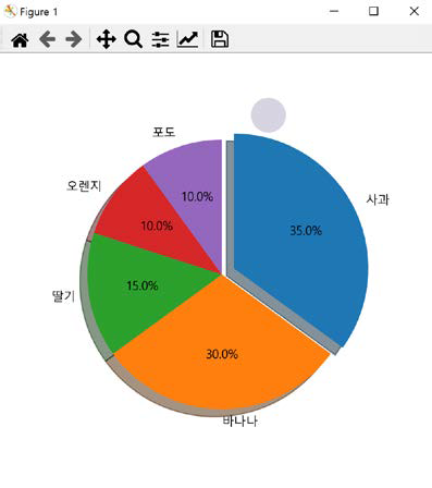
explode_value = (0.1, 0, 0, 0, 0)
plt.figure(figsize=(5,5))
plt.pie(result, labels= fruit, autopct='%.1f%%', startangle=90, counterclock = False, explode=explode_value, shadow=True)
plt.show()
matplotlib : 핵심! 그래프 저장하기~~~~
matplotlib를 이용해 생성한 그래프는 화면으로 출력할 수 있을 뿐만 아니라 이미지 파일로 저장할 수도 있습니다~
그래프를 파일로 저장하려면 다음 방법을 이용합니다.
• plt.savefig(file_name, [,dpi=dpi_n(기본은 72)])
import matplotlib
import matplotlib as mpl
import matplotlib.pyplot as plt
import numpy as np

matplotlib.rcParams['font.family'] = 'Malgun Gothic' # '맑은 고딕'으로 설정
matplotlib.rcParams['axes.unicode_minus'] = False
mpl.rcParams['figure.figsize']
mpl.rcParams['figure.dpi']
x = np.arange(0, 5, 1)
y1 = x
y2 = x + 1
y3 = x + 2
y4 = x + 3
plt.plot(x, y1, x, y2, x, y3, x, y4)
plt.grid(True)
plt.xlabel('x')
plt.ylabel('y')
plt.title('Saving a figure')
# 그래프를 이미지 파일로 저장. dpi는 100으로 설정
plt.savefig('d:\dev\workspace\python\ch12_matplotlib\saveFigTest1.png', dpi=100)
plt.show()
fruit = ['사과', '바나나', '딸기', '오렌지', '포도']
result = [7, 6, 3, 2, 2]
explode_value = (0.1, 0, 0, 0, 0)
plt.figure(figsize=(5, 5)) # 그래프의 크기를 지정
plt.pie(result, labels=fruit, autopct='%.1f%%', startangle=90,
counterclock=False, explode=explode_value, shadow=True)
# 그래프를 이미지 파일로 저장. dpi는 200으로 설정
plt.savefig('d:\dev\workspace\python\ch12_matplotlib\saveFigTest2.png', dpi=200)
plt.show()
그럼 여기까지~!
파이썬의 matplotlib에 관한 내용과 matplotlib을 활용하여 사용할 수 있는 여러 기능들에 대해 알아보았습니다.
🍁🍀🌸💐🏵🌹🌺🌿🌾🌻🌼🌷🌸💐🌵🏵🌹🌺🌻🌴🍃🌼🌷
그럼 오늘은 여기까지 공부하고 봄놀이를 즐기고 오도록 하겠습니다
🌸💐🏵🌹🌺🌳🌻🌼🌷🥀☘🌱🌲🍂🍁🍀🌸💐🏵🌹🌺🌿🌾🌻
다음 주에 뵙겠습니다!
'주니어 기초 코딩공부 > Python 기초' 카테고리의 다른 글
| Django 01 웹프로그래밍 (0) | 2023.05.03 |
|---|---|
| 파이썬 공부_사이트 (0) | 2023.03.20 |
| python 판다스(pandas Series, DataFrame, Panel) 개념 설명 (2) | 2023.03.09 |
| python 데이터 분석을 위한 패키지-넘파이 NumPy (0) | 2023.03.09 |
| python 모듈이란? (모듈, 패키지, 라이브러리 용어 정리) (0) | 2023.03.09 |